Composites and Correlations
Media Representations in the Age of AI
This week’s post is an abridged text version of my Critical Topics: AI Images class. The full video is at the end of the newsletter if you want to watch it.
JH Turner defines scientific positivism as a way of thinking “that proposed the only authentic knowledge is scientific knowledge and that all things are ultimately measurable.” This idea of measurement was at the heart of a photographic project by British sociologist Francis Galton, who invented the practice of composite portraits. Composite portraits were a single image made from a number of other photographs, all of which were assigned a category — Galton’s categories included race, class, professions, and other descriptors. Then he would create a kind of statistically average face from all of the faces in that category.
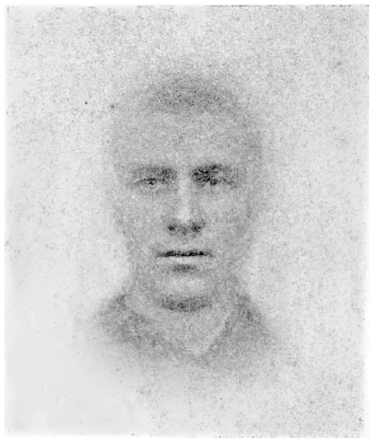
This is what our image generators do. They draw categorical information from descriptions of images, a practice that goes back to Galton. Galton believed that personality was written into the shape of our faces: our potential for success, and our likelihood of criminality. To show this, he exposed multiple photographs of mug shots from known criminals into a single photographic plate, centered on the eyes, essentially drawing one face over the other until there was not one face on the plate, but a blurry composite of many faces. Through this practice, a single, common face for that category would take shape.
This composite image, he suggested, could be used to identify people as criminal types. He was certain that if someone looked like the “average” face of a criminal, they must be a criminal themselves. Galton came to believe that these images were statistical averages to a particular mean — in fact, Galton invented the idea of correlation in statistics, a tool for finding patterns still used by machine learning today: the idea that data has correlations, or statistical relationships, is what makes these systems work.
Galton was also an avowed Eugenicist, and statistics and composite photographs were a form of supporting evidence. As the New York Times wrote about Galton in 2019:
He also tried to use composite portraits to determine the ideal “type” of each race, and his research was cited by Hans F.K. Günther, a Nazi eugenicist who wrote a book that was required reading in German schools during the Third Reich.
Galton was not only a believer in race theory, he personally named Eugenics and published books advocating for it. These two principles: composite photography, and statistical correlation, are literally derived from the same man whose theories advanced the case for the elimination of people based on physical appearances.
Galton used these composites to make his case that certain human facial features were predestined to create criminality, while other facial features would breed- literally- intellectual and moral superiority. Of course, there were no surprises in these findings: take pictures of the aristocratic families and you will see similarities. Take pictures of immigrants and malnourished kids, and you’ll see them there, too.
Ultimately, Galton’s case for these appearances was that the poor and oppressed minorities of British rule, including its colonies, deserved to be oppressed, and the aristocracy deserved to be in power. These tools of statistics, composites and photographs were part of a mechanism to assert white supremacy over others in the British Empire.
Galton made all kinds of composite images, intended to categorize and label a variety of types: one series shows us the stereotypical Jewish schoolboy; another the stereotypical aristocrat. He made composite images of successful families and suggested it was their biology and genes that made them successful, rather than their unique access to wealth and power. And families of criminals were born this way, evidenced by the shape of their faces.
Galton’s belief came down to the idea that if people looked alike then they were alike, famously conflating correlation for causation.
At the heart of what Galton was saying were a number of myths that are increasingly prevalent today. The first is that the camera was objective and neutral in its facts, an oft-repeated claim about AI’s decision making capabilities.
Second was his practice of creating composite images of people after sorting them into categories. When you create a prompt in Stable Diffusion for “criminal” or “professor,” for example, you are likely drawing on similar reference points. Compare the two images below and ask yourself: Why are these the criminals and why are these the professors? How does Midjourney form an idea of what a criminal or a professor looks like? The answer, as we’ll see, is that the stereotypes of image datasets come through in the outputs of the models they build.
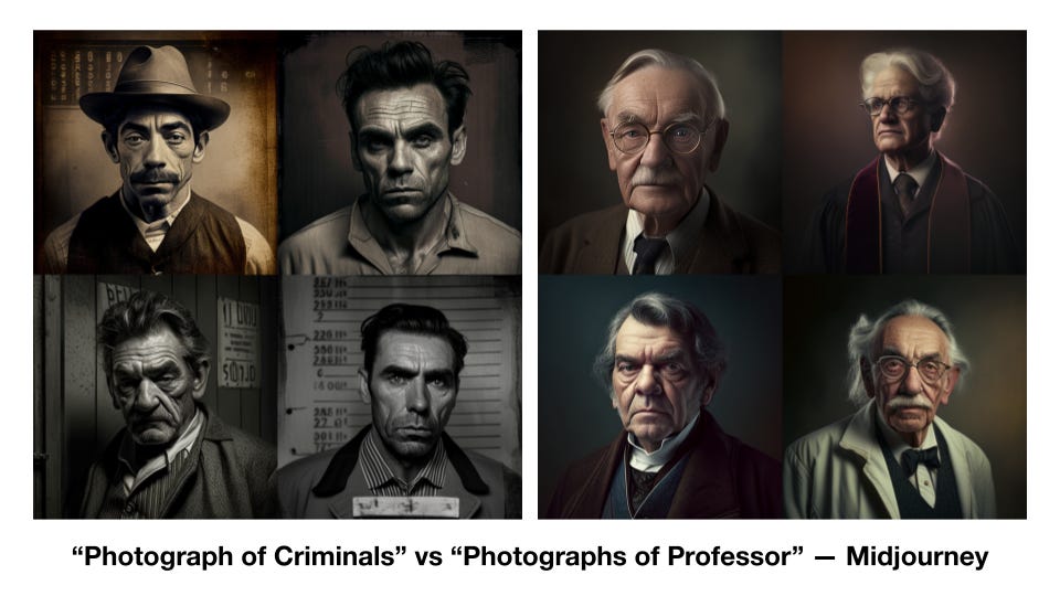
Presenting these images as they are runs the risk of reinforcing stereotypes already embedded into these image captions. But let’s get back to Galton, and his idea that correlation means causation. Galton, who pioneered this idea of correlation, was convinced that it could explain all kinds of phenomena. Today, a lot of AI is dedicated to automating the discovery of statistical correlations in large datasets. We have all this data and we need some way to understand it, so we let the machine look for correlations. Today we risk the same fallacy that Galton did: we imagine that what the machine says is true, but we don’t ask why it is true.
AI can be used to reinforce power structures in the same way that Galton’s technologies did. By controlling the images and their categories, Galton was able to say anything he wanted about the people he put onto film. He was able to carve out a dataset from the world at large, and then point at that dataset and call it proof.
Lila Lee-Morrison wrote about Francis Galton and his connection to today’s algorithms in 2019:
The advantage of the camera, for Galton, lay in its ability to visually represent the abstracting process of statistics in the form of facial images. With the practice of repetitive exposure, that is, in multiplying the reproduction process by photographing the photograph, Galton’s composites transformed the use of the imaging apparatus into a form of statistical measurement. Galton’s use of the camera to apply the abstractive process of statistics resulted in a depiction that, as Daston and Galison put it, “passed from individual to group.” (page 89)
I raise this because of how important it is to acknowledge, and how little we do acknowledge, that AI images are tied directly to three strands of thought that came from a man who used those tools to advocate for eugenics, and ultimately paved the path to a specific logic of genocide that decimated human lives across the 20th century.
This is not to say we can’t use these tools. It’s a reminder to be vigilant. They contain traces of these ideas, and uncritically embracing the logic of these systems might steer us into a position where we find ourselves inadvertently aligned with these logics.
What I want to encourage about these tools is to use them in ways that challenge the ideas that gave rise to them. On that note, you may be saying: That was all over 100 years ago, and surely, these things can’t be relevant today. Well, let’s find out.
Born on the Fourth of July
Let’s prompt “typical American” using Stable Diffusion.
Take a minute to remember what Diffusion does with this prompt. It starts with a frame of noise, and tries to remove that noise. It removes noise assuming that my prompt is the caption of the image it is trying to repair. It starts by seeking out clusters of pixel information that match some of what it learned about how images break down. Specifically, here, how images with the prompt “American” break down in common ways. These images are taken from the internet, and put into the training data. The noise that the model starts with keeps being removed to match something in that vast dataset.
Then we get a picture — and yes, this is one of the first four images I got by asking for the image “Typical American.”
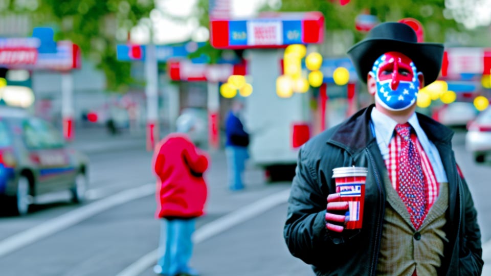
This is one of many possible composite images associated with this phrase, typical American.
I notice face paint with the American flag, which makes sense: the category for “American” probably includes the flag. Note that it also assumes that we are looking for a person. So we can assume the phrase “typical American” is often associated with images of people. We see that the man is in a cowboy hat. He’s wearing a leather jacket. He’s holding what looks to be some kind of cup, like a giant coffee cup or a slurpee.
So this is a composite image of an American, taken from a wide range of pictures that were labeled “American.” And we might want to know what that training data looked like. LAION 5B is open source, so we can go in and look at the images in the dataset. Holly Herndon and Matt Dryhurst have created an interesting tool for this, called haveibeentrained, which lets artists look up their names and see if they are in the dataset. It’s also an interesting way to scan through images that may be used in training related prompts. It’s not direct, and not complete, but gives you some sense of the underlying data.
That said, here is a sample in the data found in LAION for “American.”
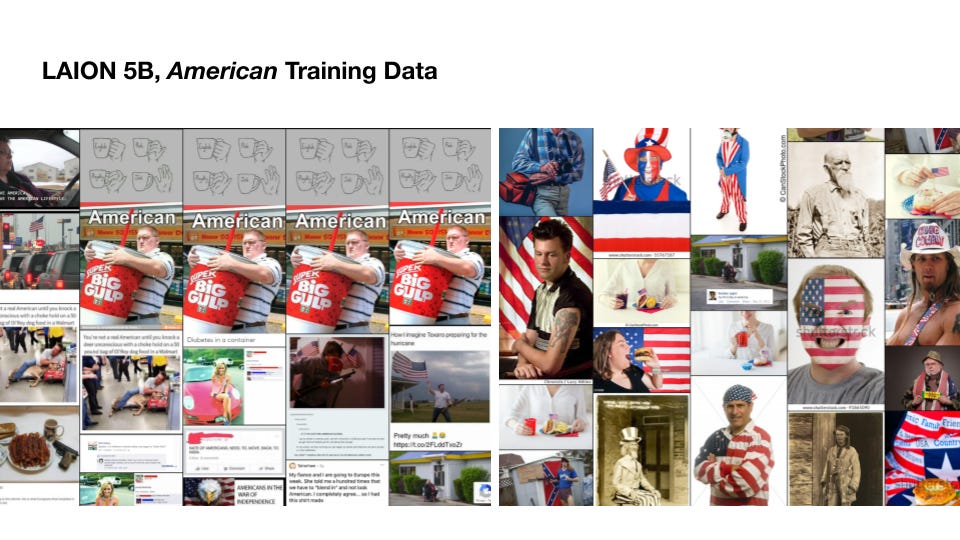
Let’s see what else we have: facepaint, as predicted. Lots of flags, cowboy hats. There is also, off to the left, two images of a man tackling a deer in a Walmart.
One thing struck me: the same image repeated four times in a meme, a man holding a Big Gulp from 7-11. How many times do you think it saw this one meme? Was every version of that meme treated as a new piece of data? If so, that means that the image is weighted more than other images, and has an outsized role in shaping the images associated with the prompt.
We can see how the system has found this word “American” connected to images across the web, broken them down into key aspects of the image, and then reassembled them into the image we generated. This isn’t some abstract philosophical idea. This is pretty direct: the images in the dataset are written into the image that was generated. Now, I want to be clear: we’re looking at two pages of results for training data associated with this word, American. There are probably hundreds of pages. So these are not the only images that are contributing to this composite image.
System Level Interventions
So we’ve seen how biases in the dataset — bias, literally, as in there is a disproportionate amount of a certain image or representation — influence the images we generate.
For diffusion models, it’s important to note that social and cultural bias is also introduced through the text and image pairings. So for example, if you ask for pictures of humans kissing, as we have talked about before, who was the system defining as “human?”
Consider the way we label images and the qualifiers we use — or don’t use. We don’t often describe people in images as “human,” for example. We might say “people.” But then, who are “people?” The word “person” very often means a specific type of person. Consider this example, taken from a new york times article in 2018:
“It’s not with bad intention, but people like to label things because it’s easier to discuss,” said Mr. Meyer, who runs Jove Meyer Events. “But the couple is not getting ‘gay’ married. They are getting married. They’re not having a ‘gay wedding.’ They’re having a wedding. You don’t go to a straight wedding and say, ‘I’m so happy to be at this straight wedding.’”
So weddings with same sex couples might be more tightly correlated with the phrase “gay wedding” while isolated from the category of “wedding.” In this case, you would have to specific gay wedding, for example, to see two men getting married. This is a categorization effect that serves as an example for many other phenomenon: “couples,” for example, creating one image-caption pair while “interracial couples” might form another. (These are hypothetical).
Today, to combat this bias, DALL-E 2 inserts diversity into your prompts — when you ask for people, you’ll get more diverse images than you did six months ago. But that’s the result of a specific, system-level intervention into the dataset. (See Fabian Offert & Thao Phan. 2022).
In summary, repetitions of data will be more strongly weighted in these systems, but so will repetitions of language and frames: the normative stuff isn’t described specifically as normative. Internet image captions, we must imagine, label gay weddings but not straight weddings; label interracial couples but not racially homogenous couples. This use of language separates the “other” into their own image-caption pairs, where they are isolated as distinct categories.
If an image appears often on the Internet, that image might be more strongly represented in the images we produce. While we can go into the dataset and see what drives these systems, each of these systems makes its own interventions. They may emphasize or isolate certain content pairs, for example.
Looking at this picture of a typical American, we can see what images are in the dataset for American, and we can make inferences.
When a Girl is not a Girl
We saw an example of one stereotype, for Typical American, and how the connection between the dataset influenced the outcome. It’s important to be aware of how representations of people are formed when we sort them into categories, especially with arbitrary, socially assigned labels.
In this video from Dr. Safiya Noble, she describes what she found in Google’s algorithmic biases in the search for “Black Girls.” Searches related to black girls should link to access to information about black children. Instead, for years, the results reflected an uglier side of the Web and its social biases. The first search result being a pornographic website, and a whole host of vulgarities right there on the first page. Actual information about, say, the health issues of black children were absent.
If you look at the Internet without that intervention, you realize that nothing has changed. Here is a small sample of images in LAION for the same search — black girls.
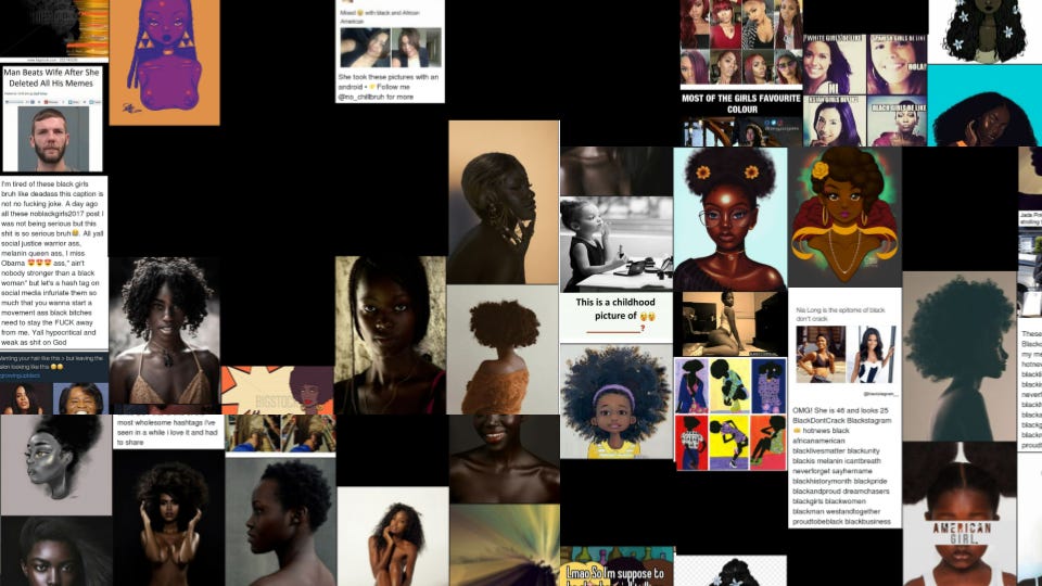
The images are often nude women; there are racist memes. The black boxes on this page represent explicit pornographic content: actual pornography that I covered it up with a black square.
Why does this happen? I think we can go back to the starting point and think about that long-ago origin of composite images. They’re linked not only to racist pseudoscience, but to the way those images reflected a particular group’s power When we have a technology that scrapes up stereotypes without intervention, and composites these images into new images, we repeat that history. It is even more disturbing to push a button labeled “dream” or “imagine” and know that the images you produce are coming from this.
Vilna Bashi Treitler writes about this idea of racial category and the power connected to who gets to define those categories for themselves:
It makes a difference who is doing the categorical defining, and who is policing the boundaries of these definitions. It comes down to a question of power: who holds it, where the power-holders see themselves and others in the existing hierarchy, where they think they should be in the racial hierarchy (that is, the meaning or racial positioning), and how they use their power to realize those norms.
This is why we focus on data — to know what is there and how it steers our systems, and to be mindful of the ways that data consolidates power and shapes our imagination and dreams.
Here we have the training data, by comparison, for the word “girl.”
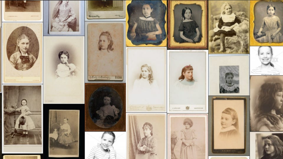
It’s hard not to look at this dataset and think about Francis Galton, and the way that his composites were used to suggest that the upper classes were superior people to all others. He proved it through photographs — photographs that probably looked a lot like these. Not just because these are images from the same time, but because they are images that reflect a certain degree of wealth amongst families who could afford to have their portraits taken, and the racial category that those families belonged to.
This sampling of data — and I looked at many pages of these returns — are all white girls, though the prompt is not for white girls. It’s just girls. It speaks to the power of the dataset to normalize one kind of definition of a word over others. For LAION, girls are white children. Black children are another category, a category separate and definitely unequal.
Nazis in the Dataset
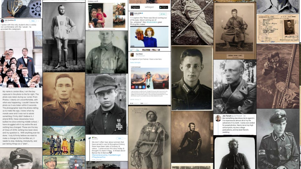
The last one I want to look at today is this, a search for photographs of a brave person. This search tells you that if you are generating images of bravery, you might get a composite from some of these images. And if you look closely, you’ll see something pretty shocking.
Scattered across the first few pages are images of Nazis.
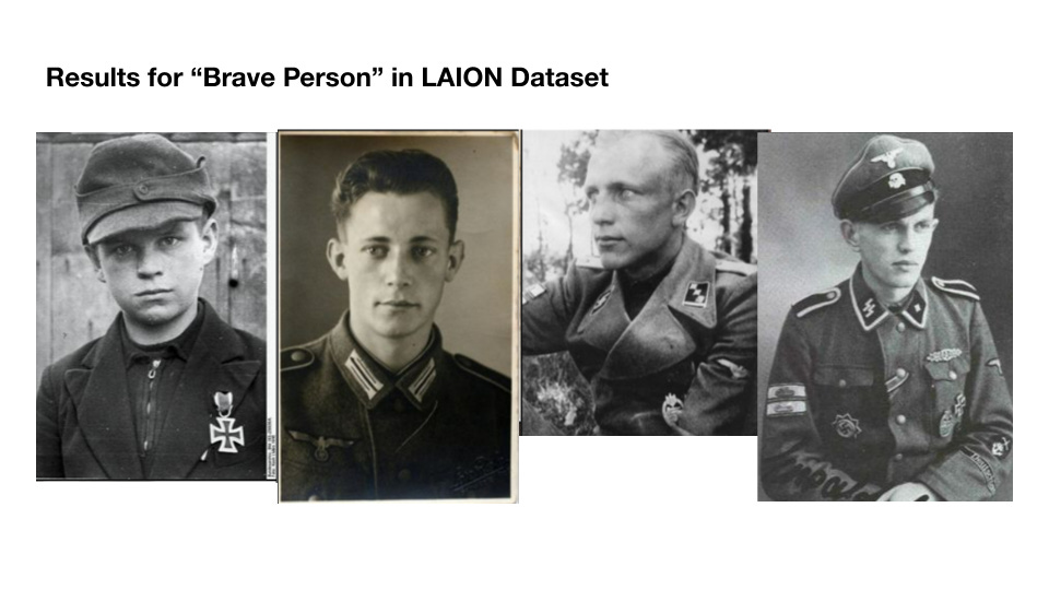
The first is an image of a young boy who was given a medal of bravery for his work with the Hitler Youth. The others are difficult to tie to specific caption information. Let’s assume that these images are neutral, that this image of the child from the Hitler Youth came from an encyclopedia article, or even a website condemning Nazis.
Once LAION encounters this image and its caption, all context is stripped away. It doesn’t care that this is a boy in a Nazi uniform. LAION will not recognize that adding this image to the category of “brave” might lead to a tendency to reproduce images of Nazi heroes.
Nazis defined themselves by the appearance of their race: blue eyes, blonde hair, and all that — appearances which, in the ideology of Eugenics, were genetic proof of a heroic character. When we include images of Nazi heroes into our generative images of heroism, we are arguably reproducing Nazi propaganda.
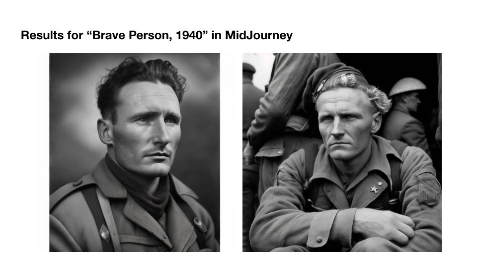
When we see images like these generated from a prompt — here, “photograph of a brave man, 1940” — we see some evidence of this. Clearly one of them is Liam Neeson. It speaks to the complex, hidden stories behind the images we make with these tools, and the crucial context we strip from their sources in the training data.
Conclusions
My point is not that images created by these systems are racist or that using them makes one a white supremacist. It is to acknowledge the virulent reunion of statistical correlation and composite images laying latent in these models and their logic. It is a warning to be vigilant against representations that reinforce these logics, and, if anything, an encouragement to use these systems in ways that subvert and dismantle those logics.
Images speak through their layers: through the contexts of other images and meanings. When we bury those layers beneath a mountain of unreadable algorithms,
we obfuscate what we encode. We become strangers to the myths we circulate. Knowing how to read these images, how to reverse engineer their assemblages, is media literacy for the 21st century.
Come to Class
Here’s the full video for the Class 10, Exploring the Datasets. The full syllabus and video list is online here.
Thanks for reading! As always, sharing posts on social media is how I find an audience. If you’re enjoying these newsletters or the AI images class, it’s always kind of you to spread the word.
I am also seeking opportunities to continue my research or to publish. If you’re looking for PhD students in fields where what you’ve read would be a fit, please let me know.
