How to Read an AI Image
The Datafication of a Kiss
Every AI generated image is an infographic about the dataset. AI images are data patterns inscribed into pictures, and they tell us stories about that dataset and the human decisions behind it.
That's why AI images can become “readable” as objects. In media studies, we understand that image-makers unconsciously encode images with certain meanings, and that viewers decode them through certain frames. Images draw their power from intentional assemblages of choices, steered toward the purpose of communication.
When we make images, we bring references. When we look at images, we make sense of them through references. Those references orient us toward or away from certain understandings. An AI has no conscious mind (and therefore no unconscious mind), but it still produces images that reference collective myths and unstated assumptions. Rather than being encoded into the unconscious minds of the viewer or artist, they are inscribed into data.
When we make a dataset, we operate within specific cultural, political, social, and economic contexts. How we frame a dataset is much the way we frame an image. We have a question we'd like to investigate. We find samples of the world that represent that question. We snap the photo when those samples come into specific alignments.
We record data this way, too. We have questions. We identify where the useful data for answering that question might be. We seek out ways to capture that data. Once captured, we allow machines to contemplate the result, or we work through it ourselves.
It’s only the scale of data that makes AI different. But the data works the same way.
Machines don't have an unconscious, but they inscribe and communicate the unconscious assumptions that are reflected and embedded into human-assembled datasets.
Can we read human myths through machine generated images — can we treat them as cultural, social, economic, and political artifacts?
To begin answering these questions, I've created a loose methodology. It's based on my training in media analysis at the London School of Economics, drawing from Roland Barthes and Judith Williamson.
Typically we use media analysis for film, photographs, or advertisements. AI images are not films or photographs. They're infographics for a dataset. But they lack a key, and information isn't distributed along an X and Y axis. How might we read unlabeled maps? Can a methodology meant to understand how human, unconscious assumptions and ideologies circulate through communication help us understand, interpret, and critique the inhuman outputs of generative imagery?
Here's my first crack and describing the method I’ve been using.
What’s Noted is Notable
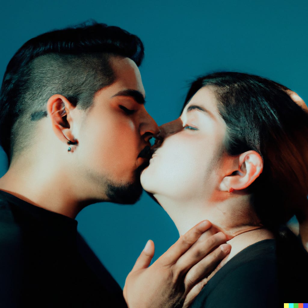
Let's start with an image that I'd like to understand. It's from OpenAI's DALLE2, a diffusion-based generative image model. DALLE2 creates images on demand from a prompt, offering four interpretations. Some are bland. But as Roland Barthes said, "What's noted is notable."
So I noted this one.

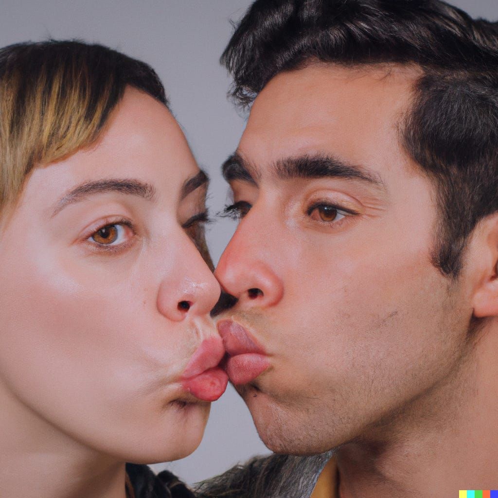
Here is an AI image created of two humans kissing. It’s obviously weird, triggering the uncanny valley effect. But what else is going on? How might we “read” this image?
Start literally. What do you see?
We see a heterosexual white couple. A reluctant male is being kissed by a woman. In this case, the man’s lips are protruding, which is rare compared to our sample. The man is also weakly represented: his eyes and ears have notable distortions.
What does it all mean? To find out, we need to start with a series of concrete questions for AI images:
1. Where did the dataset come from?
2. What is in the dataset and what isn't?
3. How was the dataset collected?
This information, combined with more established forms of critical image analysis, can give us ways to “read” the images.
Here’s how I do it.
1. Create a Sample Set
It’s challenging to find insights into a dataset through a single image. You can attempt to do a more general “reading” of the image as a photograph. However, a uniqueness of generative photography as a medium is scale: millions of images can be produced in a day, with streaks of variations and anomalies. None of these reflect a single author’s choices. They blend thousands, even millions, of choices.
By examining many images produced by a single model, from the same prompt, we can begin to “make sense” of the underlying properties of the data they draw from.
We can think of AI imagery as a series of film stills: a sequence of images, oriented toward telling the same story. The story is the dataset.
First you want to create a non-linear sequence, a sampling of images designed to tell the same story.
If you’ve created the image yourself, you’ll want to create a few variations using the same prompt or model. Nine is an arbitrary number. I’ve picked it because nine images can be placed side by side and compared in a grid. In practice, you may want to aim for 18 or 27. For some, I’ve generated 90-120.
If you’ve found the image in the wild, you can try to recreate it by describing it with as much detail as possible into your prompt window. However, this technique, for now, assumes you can control for the prompt (or, in the case of a GAN, that you know what your model has been primed on).
Here are nine more images created from the exact same prompt. If you want to generate your own, you can type “studio photography of humans kissing” into DALLE2 and grab your own samples. These samples were created for illustration purposes, so they use additional modifiers.
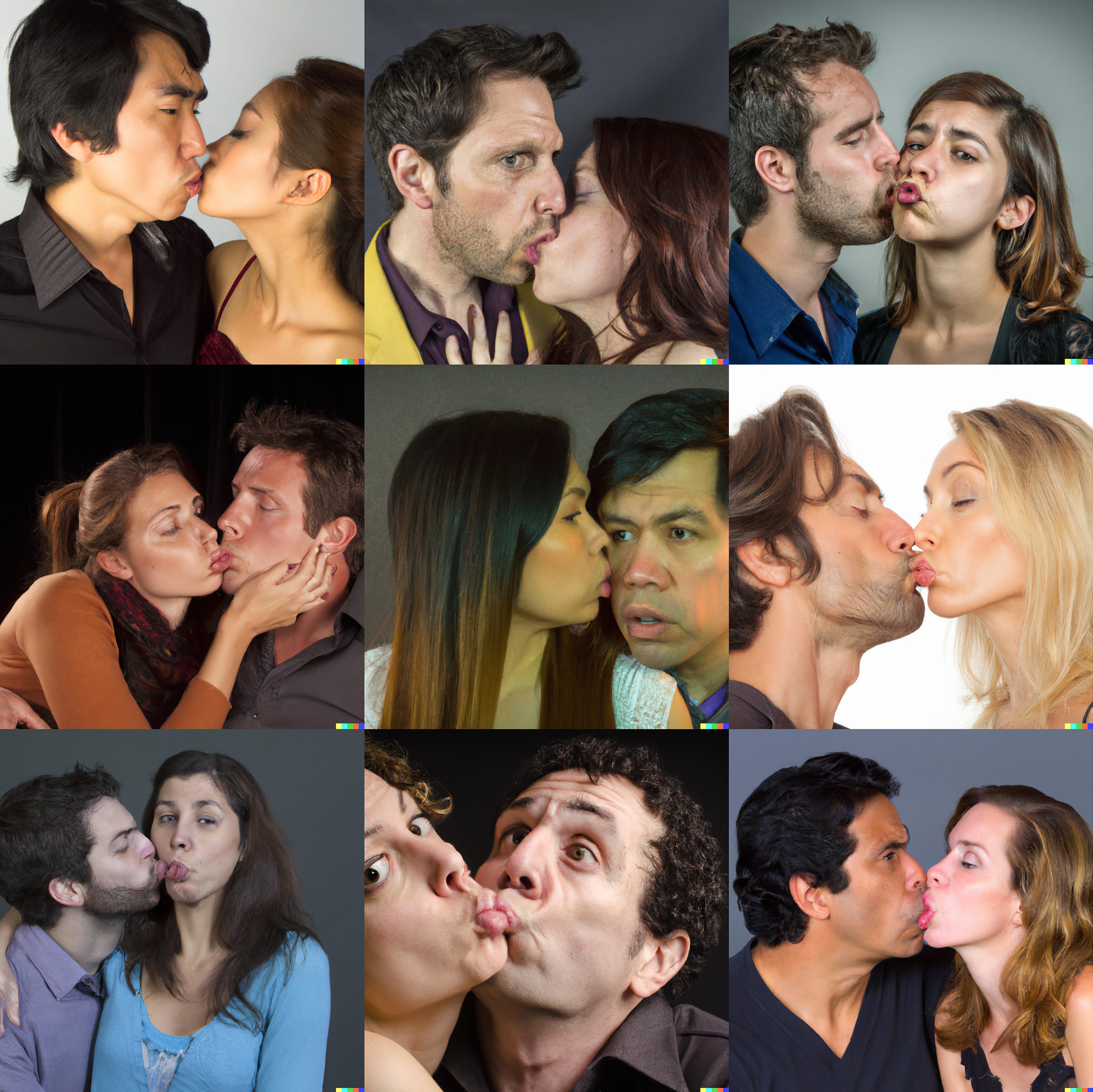
AI images are different from photography and film because they are *endlessly* generated. But even when you generate just a few, patterns will emerge. These patterns are where the underlying data reveals itself.
It’s tempting to try to be “objective” and download images at random. At the outset, this is a mistake. The image you are interested in caught your eye for a reason. Our first priority is to understand that reason. So, draw out other images that are notable, however vague and messy this notability may be. They don’t have to look like your source per se, they just have to catch your eye. The trick is in finding out why they caught your attention.
From there, we’ll start to create our real hypothesis — after that, we apply that hypothesis to random images.
2. Content Analysis
Now we can study your new set of images for patterns and similarities.
Again: what do you see? Describe it.
Are there particularly strong correlations between any of the images? Look for certain compositions/arrangements, color schemes, lighting effects, figures or poses, or other expressive elements, that are strong across all, or some meaningful subsection, of the sample pool.
These indicate certain biases in the source data. When patterns are present, we can call these “strong.” What are the patterns? What strengths are present across all of them?
In the example, the images render skin textures quite well. They seem professionally lit, with studio backgrounds. They are all close ups focused on the couple. Women tend to have protruding lips, while men tend to have their mouths closed.
Next: What are their weaknesses? Weaknesses are a comparison of those patterns to what else might be possible. In this question, two important things are apparent to me.
First, all of the couples are heteronormative, ie, men and women. Second, there is only one multiracial couple. We’ll explore this more in a moment. Third, what’s missing is any form of convincing interpersonal contact.
The “strong” pattern across the kissing itself is that they are all surrounded by hesitancy, as if an invisible barrier exists between the two “partners” in the image. The lips of the figures are inconsistent and never perfect. It’s as if the machine has never studied photographs of people kissing.
Now we can begin asking some critical questions:
- What data would need to be present to explain these strengths?
- What data would need to be absent to explain these weaknesses?
Weaknesses in your images are usually a result of:
- sparse training data,
- training biased toward other outcomes, or
- Reductive system interventions (censorship).
Strengths are usually the result of prevalence in your training data, or amplifying system interventions — the more there is in the data, the more often it will be emphasized in the image.
In short: you can “see” what’s in the data. You can’t “see” what isn’t in the data. So when something is weird, or unconvincing, or impossible to produce, that can give us insight into the underlying model.
Here’s an example. Years ago, studying the FFHQ dataset used to generate images of human faces for StyleGAN, I noted that the faces of black women were consistently more distorted than the faces of other races and genders. I asked the same question: What data was present to make white faces so strong? What data was absent to make black women’s faces so weak?
Here you can begin to formulate a hypothesis. In the case of black women’s faces being distorted, I could hypothesize that black women were underrepresented in the dataset.
In the case of kissing, something else is missing. One hypothesis would be that OpenAI didn’t have images of anyone at all kissing. That would explain the awkwardness of the poses. The other possibility is that LGBTQ people kissing are absent from the dataset.
But is that plausible? To test that theory, or whatever you find in your own samples, we would move to step three.
3. Open the Hood
You can often find the original training data in white papers associated with the model you are using. You can also use tools to look at the images in the training data for your particular prompt. This can give you another sense of whether you are interpreting the image-data relationship correctly.
We know that OpenAI trained DALLE2 on hundreds of millions of images with associated captions. While the data used in DALLE2 isn’t publicly available, you can often peek at the underlying training dataset for other models to see what references they are using to produce their images. (For the sake of this exercise, we’ll look through the LAION dataset, which is used for rival diffusion engines like MidJourney). Another method is to find training datasets and download portions of them (this may become exponentially harder as datasets become exponentially larger). For examining race and face quality in StyleGAN, I downloaded the training data — the FFHQ dataset — and randomly examined a sub-portion of training images to look for racialized patterns. Sure enough, the proportion of white faces far outweighed faces of color.
When we look at the images that LAION uses for “photograph of humans kissing,” one other thing becomes apparent: pictures of humans kissing are honestly kind of weird to begin with. The training data consists of stock photographs, where actors are sitting together and asked to kiss. This would explain some of the weirdness in the AI images of people kissing: it’s not genuine emotion on display here.
It might be tempting to say that the prevalence of heterosexual couples in stock photography contributes to the absence of LGBTQ subjects in the images. To test that, you could type “kissing” into the training data search engine. The result is for that dataset is almost exclusively pictures of women.
While DALLE2’s training data is in a black box, we can get a sense of what the data *might* look at, to further advance our hypothesis.
It suggests that there is not sparse training data for humans kissing, and it isn’t biased data (if anything, the bias runs the other way — if the training data is overwhelming images of women kissing, you would expect to see women kissing more often in your images).
So we move on to look at interventions.
4. Interventions
The weaknesses of a dataset can be seen more clearly through the training data. But there may be another intervention. One possibility is a content filter.
We know that pornographic images were removed from OpenAI’s dataset so as to ensure nobody made explicit content. Other models, because they were scraped from the internet, contain vast amounts of explicit and violent material (see Birhane 2021). OpenAI has made some attempts to mitigate this (in contrast to some open source models).
From OpenAI’s model card:
We conducted an internal audit of our filtering of sexual content to see if it concentrated or exacerbated any particular biases in the training data. We found that our initial approach to filtering of sexual content reduced the quantity of generated images of women in general, and we made adjustments to our filtering approach as a result.
Could this explain the “barrier effect” between kissing faces in our sample images? We can begin to raise questions about the boundaries that OpenAI drew around the notion of “explicit” and “sexual content.”
So we have another question: where were boundaries set between explicit/forbidden and “safe”/allowed in OpenAI’s decision-making? What cultural values are reflected in those boundaries?
We can begin to test some of our questions. OpenAI will give you a content warning if you attempt to create images depicting pornographic, violent, or hate imagery.
If you request an image of two men kissing, it creates an image of two men kissing.
If you request an image of two women kissing, you are given a flag for requesting explicit content.
So, we have a very clear example of how cultural values become inscribed into AI imagery. First, through the dataset and what is collected and trained. Then, through interventions in what can be requested.
(This is the result of meddling with a single prompt — I’m unwilling to risk being banned by the system for triggering this content warning. But if others find successful prompts, let me know).
Another system level intervention is failures in the model itself. Lips kissing may reflect a well known flaw in rendering human anatomy — see my 2020 experiments with hands.. There’s no way to constrain the properties of fingers, so they become tree roots, branching in multiple directions, multiple fingers per hand with no set length.
Lips seem to be more constrained, but the variety and complexity of lips, especially in contact, may be enough to distort the output of kissing prompts. So, it’s worth considering that as you move from observations to conclusions: these machines are not infallible, hands and points of contact between bodies — especially where skin is pressed or folds — are difficult to render well. Hand modeling may be a future-proofed career.
5. Connotative Analysis
Now we have some orientation to our images as infographic. We see the limitations and strengths, and account for system level interventions and model-level limits.
We’ve identified patterns that represent the common areas of overlap between training data: position, lighting, framing, gender, racial homogeneity.
What is it good at? Rendering photorealistic images of human faces.
What is it bad at? Diversity, rendering emotional connection, portraying humanity, and human anatomy.
The images of people kissing are all strangely disconnected, as if unsure whether to kiss on the lips, cheeks, or forehead. The images are primarily heterosexual couples, and lesbian couples are banned as explicit content.
What assumptions would be needed to render the patterns seen in our sample set of nine images?
What assumptions, for example, would cause the AI to be incapable of rendering realistic kisses well? We discussed the lips as possibly a technical constraint. But what about the facial expressions? The interactions? Is it possible that kissing would be absent from data scraped from the internet? Not likely.
More likely is that the content filter excluded kissing from the training data as a form of, or because it is so frequently associated with, explicit content.
There’s an absence of real people really kissing in the training data, and a prevalence of stock photography, which may be why the humans we see in these images seem so disconnected. It is left to present a façade of romantic imagery pulled from posed models, not human couples. The images DALLE2 produces should not be taken as evidence of understanding human behavior or emotions. It isn’t real people kissing, it isn’t “human” emotion on display. It’s a synthesis and re-presentation of posed imagery, the result of looking at millions of people pretending to kiss. Acting at the role of a couple.
We can do some thought experiments: where might “real human emotions” be present in kissing images? Wedding photographs would be a likely source, but the training data is restricted (typically) to licensed photographs. Wedding photographs are rarely public domain or Creative Commons licensed. Furthermore, the absence of any associated “regalia” of a wedding ceremony (tuxedos, wedding veils) suggests they aren’t present.
Including more explicit images in the training model likely wouldn’t solve this problem. Pornographic content would create all kinds of additional distortions. But in a move to exclude explicit content, it has also filtered out women kissing women, resulting in a series of images that recreate dominant social expectations of relationships as between “men and women.”
That warrants a much deeper analysis than I’m going to provide here. But so far we have seen examples of cultural, social, and economic values embedded into the dataset.
6. Start Over
Now, let’s return to our target image. What do you see in it that makes sense compared to what you learned? What was encoded into the image through data and decisions? How can you “make sense” of the information encoded into this image by the data that produced it?
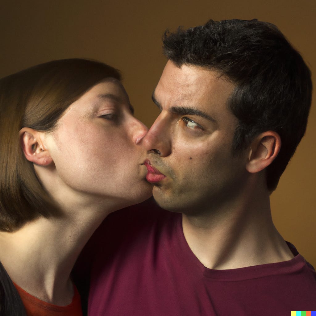
With a few theories in mind, I would run the experiment again: this time, rather than selecting images for the patterns they shared with your “notable” image, use a random sample. See if the same patterns are truly replicated across these images. How many of these images support your theory? How many of the images challenge or complicate your theories?
When we go back and look at the broader range of generated images, we can see if our observations apply consistently — or consistently enough — to make a confident assertion.
Are there any images that seem to capture the emotions of a kiss believably? Sure. Are there any images that render connected lips really well? Not really.
Remember that the presence of successful images doesn’t change the fact that weak images reveal weaknesses of data. Every image is a statistical product: odds are weighted toward certain outcomes. When you see successful outcomes fail, that’s insight into how strong those weights are. That’s what we mean by “generated images are infographics of your dataset.”
So it’s telling that we see some images that work, because we can ask questions about why they work — essentially repeating the process.
Along the way you’ll come up with insights, not real statistical claims (you could set that up, of course, by quantifying this process). But images and their interpretations are always a bit messy. Be careful in how you state your conclusions, and beware that models change every day. OpenAI could recalibrate to include images of women kissing tomorrow. It doesn’t mean those assumptions weren’t part of their model.
Conclusion
This method is a work in progress. Quantification is part of it too, and it’s not hard to do, but I’m not getting into that here today.
It’s been useful for me as a researcher. It’s succeeded in finding two underlying weaknesses of image generation models so far: the absence of black women in training datasets for StyleGAN, and now, the exclusion of lesbian women in DALLE’s output. (I’ll reiterate that this merits more discussion, but that’s beyond the scope of this post).
Ideally these insights and techniques move us away from the “magic spell” of spectacle that these images are so often granted. It gives us a deeper literacy into where these images are “drawn from.” Identifying the widespread use of stock photography, and what that means about the system’s limited understanding of human relationships and physicality, is another example.
A critique of this method might be that we could simply go look at the training data. First, many of these systems don’t share that data. That’s why we have to make informed inferences about DALLE2 by looking at datasets of a similar size and time frame.
Even when we can find the underlying data, where do we begin? When you have billions of images, the output of these systems is literally a summary of that data. I favor starting with the results of these tools first, because then we cultivate literacy and fluency in critical engagement with their output. The sooner we can move away from the seductive capacities of these images, the better.
Finally, it moves us ever further from the illusion of “neutral” and “unbiased” technologies which are still shockingly prevalent among new users of these tools. We see false attribution to generative outputs as free of human biases. That’s pure mystification. They are bias engines. Every image should be read as a map of those biases, and they are made more legible through the use of this approach.
For artists, it also points to the heart of my practice: using tools to reveal themselves. I do consider these “AI generated images of humans kissing” to be a kind of artwork. It’s a tool used to visualize gaps, absences, exclusions and presence in the dataset. It’s only one use of the tool for artmaking, and certainly not the only “valid” one, but it’s the closest I can come to wrestling with the machine to serve my purposes instead of its own. For that reason, I do consider the output, as simple as it is, to be the “artistic result” of an artistic research process.
Please share this post and encourage friends to read or subscribe! I do this for free, and my reward (sadly) is literally limited to social media engagement. So if you like this post or find it useful, it would be awesome to say so on your social networks. Thanks!
